7 Tips for Choosing Digital Menu Boards for Restaurants
Choosing digital menu boards for restaurants involves more than selecting a bright screen and attractive template. The right system should support fast decisions, clear pricing, and smooth service during busy periods. A customer standing three meters away must read the lunch special without stepping forward. Staff should update sold-out items quickly, even during a crowded dinner shift. These practical moments reveal whether a display truly fits the restaurant.
This guide explores seven important considerations, including screen size, brightness, content management, durability, installation, accessibility, and total cost. Restaurant operators should examine glare near windows, heat around kitchen entrances, and viewing angles across the dining area. Reliable software matters too. A slow update can create confusion when ingredients change or a popular dish sells out. Small details matter.
Experience from daily operations often challenges showroom promises. A screen may look excellent in a quiet demonstration but feel distracting under harsh ceiling lights. A lower-cost system may also become expensive when support fees and replacement parts appear later. There is no universal solution. A compact café may need simple displays, while a multi-location brand may require centralized control and consistent branding. Careful testing remains essential. Review the menu from a customer’s distance, ask staff to make a live update, and check readability at different times of day. Even then, the first setup may need refinement. Good digital menu boards for restaurants are not merely decorative; they should make ordering clearer, service more efficient, and the customer experience more dependable.
Understanding the Role of Digital Menu Boards in Restaurants
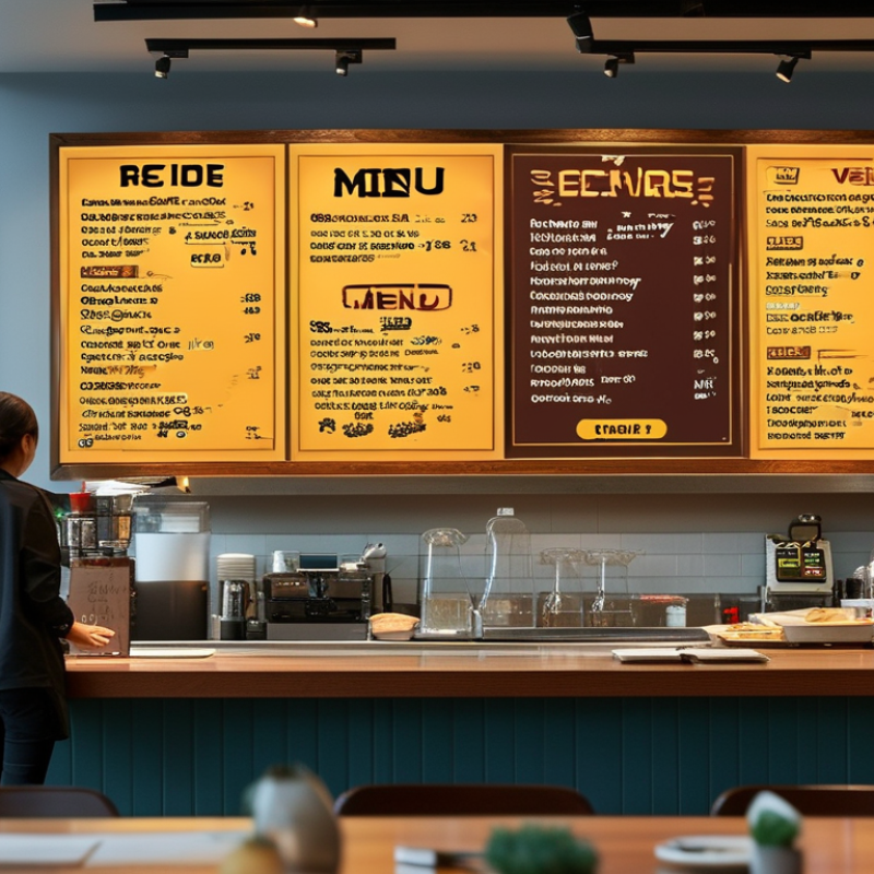
Digital menu boards do more than display prices. They shape how guests read, choose, and move through a restaurant. A bright screen near a sunny window may look attractive, yet glare can hide small text. A well-designed board uses clear sections, readable fonts, and strong contrast. Guests should understand the menu within seconds. They should not need staff assistance for every choice.
When choosing a system, check seven practical areas: screen brightness, viewing distance, layout flexibility, update speed, network stability, maintenance, and total cost. The display should remain readable from the entrance and the ordering line. Software should support quick changes for sold-out dishes or seasonal prices. Offline access matters when the internet fails. It happens. The hardware also needs protection from heat, grease, and frequent cleaning. A simple content system can reduce staff mistakes, especially during busy service. However, attractive animation may slow decisions, so movement should support information rather than distract guests.
Reliable menu boards also improve consistency across several dining areas. Managers can review updates, approval steps, and display status from one controlled system. Accessibility deserves attention too. Use readable text, sensible colors, and enough time for guests to scan each section. In one small dining room test, larger prices improved ordering speed, but crowded screens created confusion. That result challenged our first design assumption. More information is not always better. Good selection requires observing real guests, measuring screen performance, and revising the layout when the evidence disagrees.
Identifying Display Features That Match Your Restaurant’s Needs
Choosing a digital menu board starts with your restaurant’s service pattern. The National Restaurant Association’s 2024 State of the Restaurant Industry report found that 76% of operators view technology as a competitive advantage. That finding supports flexible displays, but technology should solve a real bottleneck. For a busy counter, choose high brightness, anti-glare glass, and fast content updates. Test the screen beside a window at noon. Color accuracy also matters when grilled items, sauces, and desserts drive sales. For drive-through areas, weather resistance and readable typography deserve priority.
Match screen size to viewing distance and queue movement. A small café may need one vertical display near the register. A large dining room may need synchronized screens with different menu zones. Touch capability can support browsing, but it may slow service during rush periods. Be careful there. I once prioritized thin bezels over viewing angle; the installation looked polished, yet guests near the entrance saw washed-out images. That mistake cost more than expected.
Energy use deserves equal attention. The U.S. Department of Energy identifies operating hours, brightness, and standby settings as major factors in commercial display consumption. Select automatic brightness control, scheduling, and remote diagnostics. The 2024 restaurant industry report also highlights continued customer demand for digital ordering and payment options. Therefore, check network stability, accessibility, mounting height, and backup procedures before purchase. A board that freezes during lunch is not innovative. It is an expensive queue marker. Review performance after two weeks, because real customer behavior may challenge your original assumptions.
7 Tips for Choosing Digital Menu Boards for Restaurants
Identifying display features that match your restaurant’s needs
Use these practical planning targets when comparing commercial menu displays: higher brightness suits window-facing areas, Full HD supports clear menu layouts, wide viewing angles help guests read from different positions, and 16-hour operation reflects a typical daily service schedule. Adjust the targets for ambient light, viewing distance, operating hours, and local warranty requirements.
Evaluating Menu Software, Content Updates, and System Integration
Choosing a digital menu board starts with software, not the screen.
During a busy lunch service, staff need to change a sold-out dish quickly. A clear dashboard should support scheduled updates, menu variations, pricing controls, and approval steps. Test these tasks with real staff before purchasing. Not an office demo.
The system should keep an audit trail, showing who changed a price and when. Look for role-based access and dependable backups. Short training matters too. If updates feel complicated, errors may appear during the rush. We learned this the hard way.
Content quality depends on a reliable workflow. Use bright food images carefully, readable type, and strong contrast from several viewing distances. A menu should not feel like a crowded poster.
Create templates for breakfast, seasonal offers, allergens, and local pricing. Then connect the software with point-of-sale, inventory, ordering, and kitchen displays. Integration should transfer accurate item names, prices, availability, and modifiers. Ask how failures are handled when internet access drops. A cached menu may protect service, but it could show outdated prices.
Test recovery, not just connection. Measure update time, customer questions, and order mistakes after launch. These details show whether the system improves service. Perfect integration is rarely immediate. A small mismatch can reveal a larger process problem. Review the workflow regularly, because staff needs and customer behavior can change faster than expected.